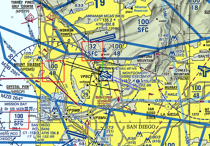
Pilots use this aviation terminal chart all the time. Green lines show the distance between Montgomery Field and nearby airspace. Black lines show departure paths, while purple lines are arrival routes. Red squares depict altitudes (in hundreds, add two zeros) to follow (100/48 is busy airspace with airlines and jets; 32/SFC is busy airspace for military use; SFC/10,000 means heavy airline activity to the south).
March 17, 2018
 Facebook
 X
X  Instagram
 TikTok
 Youtube