 Facebook
 X
X
 Instagram
 TikTok
 Youtube

In 1922, noted newspaper mogul and philanthropist Ellen Browning Scripps, then 85 years old, spent some time recuperating from a broken hip at the La Jolla Sanitarium, a small, 10-bed hospital she’d paid to build on the 400 block of Prospect Street. Finding the facility lacking overall and insufficient in size to serve the growing town, she set out to build a larger one, on land she and her brother owned next door.
Completed in 1924, Scripps Memorial Hospital originally had 57 beds, and was a dramatic improvement over the simple Sanitarium, which would eventually be absorbed as the facility next door grew to a total of 105 beds through a 1950 addition nearly two decades after Scripps’ death. Even so, within a decade, La Jollans’ need for medical facilities outgrew the space, and in 1977, the complex was converted for research use by a government contractor. A decade later, the building was abandoned entirely, and it would spend another 12 years sitting vacant until development commenced to turn the site into a 47-unit condominium project.

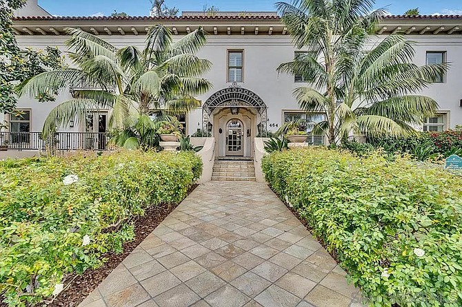
That brings us to unit 501 at 464 Prospect Street, and perhaps explains why the first line of the Zillow remarks endeavors to assure us that this is a “Magnificent unit that lives like a home.” Which is the hope, because that’s what it’s supposed to be now. Let’s take a look around. Out front, we get a hedge-lined stone walkway leading to the front entry, flanked by a pair of large palms. The original façade (well, not really — the old Sanitarium building was refaced in 1928 to match the new hospital) remains, which instantly lends the property more character than literally any other condo in San Diego. So far, so good.
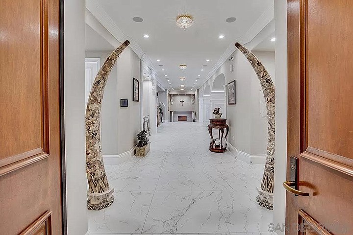
Double doors open onto a very white entry hall with enormous marble tiles lining the floor (the listing tells us a recent remodel added radiant heat, so they don’t have to be cold) and some columns that look almost like a cross between totems and oversized elephant tusks. Not sure I like these, and the canned lights alternating with what look to be speakers in the ceiling feel very much like something I would see in a hospital. Next we see more white hallways, though these at least offer some intricate carvings in the columns that support the arches between the rooms. I wonder if these are original, and if so, if there’s any way to get them back to the dark polished wood which I’m sure served as their original finish, and which the grandfather clock in a corner still retains. A bit of color here (aside from the clock) wouldn’t be unwelcome.
The remodel also included a new kitchen, which looks very much like what you’d expect in a rich person’s house, but is thankfully not described as a “chef’s delight” or some other such nonsense that loses all meaning when every copywriter for every listing deploys it. It is still too white, but the black stone and yellowish wood on the center island add decent contrast to the white-on-white-on-white floors, cabinets, and counters that surround it.
From there, we get a small, informal dining area off the kitchen and a larger, fancier dining set with seating for a dozen people adjacent to the living room. There’s a fireplace that thankfully doesn’t have a giant television hanging over it — though it turns out the TV is just mounted against a different living room wall. The bigger couch faces the fireplace, rather than the screen, which is nice. An office has a good built-in desk and shelving that wraps around to a window bench seat that (sadly) probably doesn’t see much use, because why would you sit behind the person at the desk instead of in the artsy and uncomfortable-looking chair in front of it? The bathrooms are fine, really, even though the gold plumbing fixtures aren’t really my thing. The one with the toilet sandwiched between a pair of cabinets does seem a bit weird, though. We get some red accent walls to go with the red ceiling in the office that I forgot to mention, so there is at least some color once we get out of the main living area.
A stairway to a lower level is very wide and pauses at a landing halfway down. This is not something I’m used to seeing in a house unless the stairs are turning a corner, but for a hospital, I suppose they’re not out of place. Down here, we get to see what I assume is the primary suite, and now we’re treated to some serious coloration. That color is lavender: on the walls, on the drapes, on the cabinets and the crown molding in the bathroom. There’s even a purple vessel sink in there. The tile surrounding the bathtub looks almost like it’s a stained glass window, which is an interesting and good choice.
We get a couple more bedroom and bathroom shots, and then we’re back outside, leaving through a spacious covered patio that looks out into the building courtyard. This is a pleasant space and would be great for relaxing outdoors, but sadly there is neither furniture nor a barbecue out here. (I hope the homeowners’ association doesn’t outlaw them, like the terrible complex I lived in for years.) What we do know about the HOA is that they charge a whopping $3353 a month in owner fees. For that, according to the listing, you’ll get “concierge service, a wine tasting room, indoor pool, gym, and spacious roof top deck with panoramic ocean views.” I would plan on using the heck out of all that in order to get my money’s worth.
The Prospect unit, which last sold in late 2019 for a reported $3.6 million (it looks like the remodel hadn’t happened yet), was listed in mid-June for $5 million, a price that remains unchanged to date.


In 1922, noted newspaper mogul and philanthropist Ellen Browning Scripps, then 85 years old, spent some time recuperating from a broken hip at the La Jolla Sanitarium, a small, 10-bed hospital she’d paid to build on the 400 block of Prospect Street. Finding the facility lacking overall and insufficient in size to serve the growing town, she set out to build a larger one, on land she and her brother owned next door.
Completed in 1924, Scripps Memorial Hospital originally had 57 beds, and was a dramatic improvement over the simple Sanitarium, which would eventually be absorbed as the facility next door grew to a total of 105 beds through a 1950 addition nearly two decades after Scripps’ death. Even so, within a decade, La Jollans’ need for medical facilities outgrew the space, and in 1977, the complex was converted for research use by a government contractor. A decade later, the building was abandoned entirely, and it would spend another 12 years sitting vacant until development commenced to turn the site into a 47-unit condominium project.

That brings us to unit 501 at 464 Prospect Street, and perhaps explains why the first line of the Zillow remarks endeavors to assure us that this is a “Magnificent unit that lives like a home.” Which is the hope, because that’s what it’s supposed to be now. Let’s take a look around. Out front, we get a hedge-lined stone walkway leading to the front entry, flanked by a pair of large palms. The original façade (well, not really — the old Sanitarium building was refaced in 1928 to match the new hospital) remains, which instantly lends the property more character than literally any other condo in San Diego. So far, so good.
Double doors open onto a very white entry hall with enormous marble tiles lining the floor (the listing tells us a recent remodel added radiant heat, so they don’t have to be cold) and some columns that look almost like a cross between totems and oversized elephant tusks. Not sure I like these, and the canned lights alternating with what look to be speakers in the ceiling feel very much like something I would see in a hospital. Next we see more white hallways, though these at least offer some intricate carvings in the columns that support the arches between the rooms. I wonder if these are original, and if so, if there’s any way to get them back to the dark polished wood which I’m sure served as their original finish, and which the grandfather clock in a corner still retains. A bit of color here (aside from the clock) wouldn’t be unwelcome.
The remodel also included a new kitchen, which looks very much like what you’d expect in a rich person’s house, but is thankfully not described as a “chef’s delight” or some other such nonsense that loses all meaning when every copywriter for every listing deploys it. It is still too white, but the black stone and yellowish wood on the center island add decent contrast to the white-on-white-on-white floors, cabinets, and counters that surround it.
From there, we get a small, informal dining area off the kitchen and a larger, fancier dining set with seating for a dozen people adjacent to the living room. There’s a fireplace that thankfully doesn’t have a giant television hanging over it — though it turns out the TV is just mounted against a different living room wall. The bigger couch faces the fireplace, rather than the screen, which is nice. An office has a good built-in desk and shelving that wraps around to a window bench seat that (sadly) probably doesn’t see much use, because why would you sit behind the person at the desk instead of in the artsy and uncomfortable-looking chair in front of it? The bathrooms are fine, really, even though the gold plumbing fixtures aren’t really my thing. The one with the toilet sandwiched between a pair of cabinets does seem a bit weird, though. We get some red accent walls to go with the red ceiling in the office that I forgot to mention, so there is at least some color once we get out of the main living area.
A stairway to a lower level is very wide and pauses at a landing halfway down. This is not something I’m used to seeing in a house unless the stairs are turning a corner, but for a hospital, I suppose they’re not out of place. Down here, we get to see what I assume is the primary suite, and now we’re treated to some serious coloration. That color is lavender: on the walls, on the drapes, on the cabinets and the crown molding in the bathroom. There’s even a purple vessel sink in there. The tile surrounding the bathtub looks almost like it’s a stained glass window, which is an interesting and good choice.
We get a couple more bedroom and bathroom shots, and then we’re back outside, leaving through a spacious covered patio that looks out into the building courtyard. This is a pleasant space and would be great for relaxing outdoors, but sadly there is neither furniture nor a barbecue out here. (I hope the homeowners’ association doesn’t outlaw them, like the terrible complex I lived in for years.) What we do know about the HOA is that they charge a whopping $3353 a month in owner fees. For that, according to the listing, you’ll get “concierge service, a wine tasting room, indoor pool, gym, and spacious roof top deck with panoramic ocean views.” I would plan on using the heck out of all that in order to get my money’s worth.
The Prospect unit, which last sold in late 2019 for a reported $3.6 million (it looks like the remodel hadn’t happened yet), was listed in mid-June for $5 million, a price that remains unchanged to date.