 Facebook
 X
X
 Instagram
 TikTok
 Youtube

I sometimes get asked “Who’s your favorite writer?” “What’s your favorite play?” Well, Shakespeare and Chekhov certainly, Michel de Montaigne, whose wisdom grows as I grow older. But what about Homer or Simone Weil, or those that pop to mind depending on the phase of the moon or the length of the checkout line? It’s hard to narrow them down.
Theater in 2016 has that same, tough decision feel. Overall, this was a good — but not great — year. The misses missed by miles. What, for example, was the Old Globe’s antic Macbeth all about? Finding humor amid the gore? “Unsex me here...tee-hee”? Or New Village Arts’ God of Carnage, where bombarding lights and noises upstaged screaming actors?
It’s easy to identify the clunkers, much harder to isolate a single performance or design, since many were so memorable.
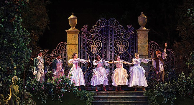
Scenic designs: John Lee Beatty created tall rows of Hollywood Squares–like cubicles for the La Jolla Playhouse’s world premiere of Junk: The Golden Age of Debt. They fit the epic drama about junk bonds and hostile takeovers to a T. Also last summer, Beatty turned the Lowell Davies outdoor stage into a gorgeous Renaissance garden for the Old Globe’s Love’s Labor’s Lost: flowing lawn, stately trees, thickets of ivy, graceful marble stairs. If one were to study for three years far from the world, as the males vow in Act One, this would be the place (though the white marble statue of a naked woman overlooking the scene might prove a distraction).
But what about Claudio Raygoza’s run-down motel and parking lot for Ion’s Airline Highway? Chipped paint and the chassis of a dead car felt so authentic you could almost smell the rankness. Plus, and no mean feat, every object onstage had the exact same degree of dissipation.
Chad Oakley’s set for OnStage Playhouse’s Coyote on a Fence put the audience in the Death Row Unit of Alabama State Prison: chain-link fences, two cells, glass guard booth (fully realized in the theater’s compact space). At the door, a guard frisked each ticket-holder with a metal detector.
Okay, but then what about Sean Fanning’s body of work? In many respects, 2016 was the Year of Sean Fanning. He designed (I may miss some) sets for: The Boy Who Danced on Air, Now or Later, and Mystery of Love and Sex at Diversionary; Brownsville Song (B-side for Trey) at Moxie; Gypsy and Seven Guitars/King Hedley II (where he aged the Seven Guitars set 40 years for King Hedley II) at Cygnet; a striking, Californio-flavored hacienda for the Rep’s Manifest Destinitis; and he re-created the original dimensions of Shakespeare’s Globe Theatre for Lamb’s Equivocation. Each did all the duties — define period, evoke atmosphere, be playable — yet only called attention to itself when required.
Quality design work makes it difficult to separate elements. The Old Globe’s October Sky, for instance. The musical was too commercially eager to please for my tastes. But Kevin Depinet’s set (with an enormous wooden arch over the stage), Japhy Weideman’s lights, and Shawn Sagady’s projections brought the Blue Ridge Mountains to the Old Globe with blazing sunsets, low-lying mists, and pre-smog blue skies that may have existed in 1957, when the musical is set, but not since. Such coordination makes it hard to separate the various contributions.
Same with costumes. For Ion Theatre’s Sunday in the Park with George, Janet Turner Pitcher had to replicate everything worn in George Seurat’s masterpiece A Sunday on the Grande Jatte. And did: autumnal hues and apparel of different social classes interwove like Seurat’s pontilistic dots.
Jennifer Brawn Gittings showed her versatility with outre, trash-bash getup for Richard O’Brien’s Rocky Horror Show at Cygnet; and Alta California in the late 1840s, for the Rep’s Manifest Destinitis, pure period styles, precise comic touches.
And Michael Krass’s flowering of apparel for the Old Globe’s Love’s Labor’s Lost. Puffy, 18th-century silken dresses in spring pastels, green uniforms (to match Beatty’s “royal garden”), and floor-length, scholar/wizard mufti — Antique fuchsia? — for the pedantic Holofernes.
Cudos often go to design work that stands out. But most fail if they call attention to themselves. Instead, like a bass in an orchestra, they should be felt, not heard, like Anastasia Pauktova’s for the Rep’s Disgraced, and Jeanne Reith’s subtle work for Intrepid Theatre’s Who’s Afraid of Virginia Woolf? George and Martha’s professor/professor’s wife outfits help define them without screaming “I’m George, see by my tweedy getup?” or “Martha here. Note my wine-stained cocktail dress in untoward dishevelment.”
Projections for theater have come so far, some schools offer a major on the subject. In San Diego, this area has improved considerably in the past decade. They’ve become less intrusive; there’s less a sense of a technological invasion of live theater. For Way Downriver, Aaron Rumley flooded the North Coast Rep’s intimate space with mad, rampaging videos of the “Great” Mississippi River flood of 1927.
The book for Joe DiPietro’s “noir thriller” Hollywood needed a rewrite or five. But at the La Jolla Playhouse Tara Knight’s projections (combined with Howell Brinkley’s lighting and Chris Luessmann’s sound) were outstanding. Flickers and flashbulbs, frantic headlines for subtitles, the clicking of an ancient movie projector made the stage a cross between theater and a silent movie.
Call it the Peter Herman Effect. Since he’s been designing wigs for local stages, the overall quality has improved so much that now a bad one stands out.
Next time: Part Two. Performance.
Comments