 Facebook
 X
X
 Instagram
 TikTok
 Youtube

Ten years ago, construction was completed on the Rob Quigley-designed La Pensione Hotel, which sits at the intersection of India and Date Streets in Little Italy. The four-story hotel, recalls Quigley, was "by far the largest structure in the neighborhood at that time," and so its design presented a number of problems for the architect, who believes that buildings should have some connection to the particular character of an area, a character that is partly determined by its architectural history.

"The idea of [La Pensione] was, number one, to respect the past," he explains. The first consequence of that idea was the decision not to scrape the lot down to bare earth. The pre-existing building on this corner -- which, though not architecturally significant, still represented a piece of the original Little Italy -- was preserved in toto, even to the point of rebuilding damaged areas.
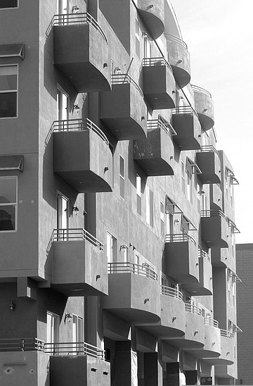
Next came the problem of respecting India Street's mostly one-story cornice line while adding the "tremendous amount of density" required by the hotel. That was accomplished by setting the second story six feet back, thus creating a line, if not a boundary, at the one-story level. "It had to be different, but the same -- which is a really tough architectural problem." Further, besides being taller than the rest of the neighborhood's buildings, the hotel was also wider, occupying two of the 50-foot lots that divided the other structures along India Street. "So what we did was to divide the building architecturally into two buildings, so that it kept the rhythm of the original lots." That's why the building is painted two different colors, and that's why there's a passageway into an alcove midway along the hotel's eastern face. The color shift and the corridor helped create the impression of two separate structures.
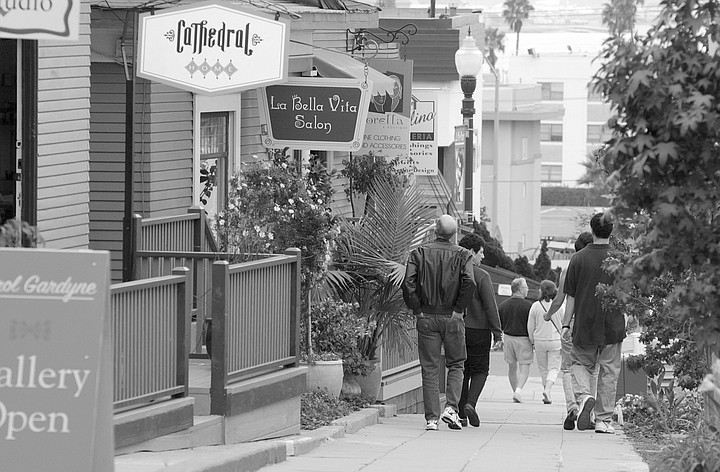
The corridor also allowed Quigley to collect another echo of the existing architecture. "I noticed that in a lot of the old buildings along India, there was a courtyard [behind the building] in the center of the block, with an access [through the building]. That doesn't happen anywhere else downtown that I know of; it's an item that's particular to this area of Little Italy. I was looking for those kinds of particulars, so that I could re-create my own version of that and add to the personality that helps make this neighborhood unique. And then the idea was to go one better: not only to recapture the idea, but to improve on the idea. So I made sure that, from the street, you could literally look into the courtyard." The courtyard now serves as a seating area for Caffé Italia, which occupies part of the hotel's ground floor.
"The reason we did all those things was that we hoped it could serve as a learning device for someone else who wanted to build in the area," he concludes. "They could learn from my mistakes and my successes. Little Italy would then grow into a place that was unique, particular."
For a while, it looked as if his plan was working. Ten years later, Quigley is able to say, "There are at least ten major architectural award-winning structures within five blocks of Caffé Italia. Here's my fantasy: that one of the things that characterizes this neighborhood is good architecture -- small interventions by very talented architects."
By "small interventions," Quigley doesn't necessarily mean small buildings, but rather, buildings that fit into the overall scale and scheme of their surroundings. Jonathan Segal's Waterfront project on Kettner, while sending walls soaring above the roofline of the Waterfront, makes the historic restaurant/bar a brightly colored focal point, as well as weaving its way around and above several pre-existing warehouses. "It's not a very economical way to develop," grants Quigley, "but it's the proper way. If you scrape a block, you emasculate a neighborhood. It has no heritage; it has no history."
All these ideas and aspirations found something of a culmination in the Little Italy Neighborhood Developers project on the block of India Street between Beech and Cedar. "I think one of the more important events of my life was the building of the Neighborhood Developers project," says Quigley. Six architects and a landscape architect collaborated to create a city block that, while technically a single development, preserved the rhythm of what came before. The Harbor Marine Supply building was retained. Pedestrian passersby were able to see into the inner courtyards. Multiple buildings maintained the effect of individual lots. Even the largest of the structures, the one designed by Quigley, dips its four-story roofline at its middle and allows a swath of orangey red to break up its crocodile-green façade.
The color depth and flat tone of that murky green were no accident. Quigley's contribution to the project bought into the idea that "not every building should be an aggressive, foreground building. A community needs background buildings as well," especially, perhaps, when said building is relatively large in comparison with what stands around it. The dark color makes it appear smaller. Like the structure that houses Quigley's offices at Cedar and Columbia, it absorbs light rather than reflect it. Further, he observes, "The buildings of mine that have been light-colored stucco [have not] weathered very gracefully. They get stained; the planes flying into the airport dump fuel on us daily. The grayer buildings...take on a patina a little more gracefully. In a certain way, that harkens back to Italian architecture. There's one idea of Italian architecture that has to do with color, but there's another, from Tuscany and other areas, that has to do with the patina that materials take on naturally over a period of time."
But if La Pensione was a flag planted to claim Little Italy for the fine-scale interventionists, and if the Neighborhood Developers project was the homestead built on that claim, then the squatters have arrived. Directly across India Street, construction on the 72-unit Village Walk condominium building proceeds apace, covering an entire half-block. One block over, another half-block of condos, Porto Siena, is also underway. "I'm horrified," says Quigley. "They're really not learning, I don't think, from the idea of making something that's unique to Little Italy. They're doing it in the most superficial way possible, which is stylistic. In other words, [they're saying], 'This building will be a part of Little Italy because it has an Italian planter box on it.' It's not about seeing into courtyards; it's not about the 50-foot rhythm; it's not about multiple personalities on a single block. It's about buying as much property as you can, building as densely as you can, and putting some architectural frosting on the outer wrapper as a gesture toward the neighborhood. I think it's unfortunate but economically inevitable."
I visited the Village Walk sales center (located, ironically enough, in Quigley's building across the street) to get a look at a model of the finished product. The southwest corner of Village Walk, which serves as its principal entrance, is concave -- an inward curve to welcome the weary traveler. Building has begun on a large fountain occupying the space left by the retreating corner, which may or may not be what Quigley was getting at with the term "architectural frosting." Fountains are certainly associated with Italy, but that does not mean they are associated with Little Italy. Further evidence of this quest for association with things Italian -- however little they have to do with the neighborhood -- comes from the names of the sample floor plans shown on the salesroom walls, names like Caruso, Pavarotti, and Sinatra. (To be fair, it should be noted that Village Walk will feature interior courtyards and that, if the display is to be believed, these will be at least partly visible from outside the building.)
The most visible -- and in some ways, the most curious -- echo of Italy comes from the project's use of color. The curved façade alone presents variously sized blocks of terra cotta, mint green, cream, light mustard, gray, lavender, and a pale gray-green. These colors appear again in rectangular swaths across the balcony-studded face of Village Walk, along with butter yellow and a rich light purple. The mind suspects a pattern, but it proves elusive.
A gentleman approached me as I stood pondering the display model; I asked him about the color scheme. "We get so many questions about that, we had this display made up," he smiled, leading me to a collection of photos on the wall. "This is Burano, Italy," he explained, and I looked at the various scenes of life in what appeared to be an Italian fishing village. What caught my eye was a series of row houses -- each sharing a wall with the one next to it -- painted in an array of colors vibrant enough to make the eye ache: bright crimson, brighter royal blue. "See that?" asked the man, pointing at the red house. "Now see that?" he said, pointing to the display model, which could offer only the dull, brick-tinged terra cotta for comparison. "Pretty close."
That "pretty close" is why I say that this echo of Italy was the most curious -- at least, to me. The colors do not match; Village Walk is a muted reflection of those searing shades, a reflection that took the row houses' neat rainbow stripes of color and scattered them as if through random crystal -- a bit of purple here, a bit of yellow there, and so on. The colors are not Burano's, nor are they Little Italy's. And while they are comparatively quiet, they are still bright in comparison to Quigley's light-guzzling green, making Village Walk, already far bigger than anything around it, seem even more gargantuan.
Village Walk does have this advantage over its northern neighbor, Porto Siena: it stands next to the three-story Mexican Consul, which provides a step between the condo's six-and-a-half-story enormity and the one-story humility of the Auto Radio Specialist shop on the consul's opposite side. Porto Siena's five-plus stories butt up against the single story of Solunto's; the effect promises to be that of a sheer cliff wall rising out of nowhere, emphasizing the disproportionate scale. The multistory hotel Villa Caterina does sit on the same block, but its narrowness seems to apologize for its height, making amends to the eye of the beholder.
Elsewhere, the battle for the neighborhood takes on a different aspect. On the "Italian feeling" side, Little Italy seems to be becoming self-conscious, mining its own past for nostalgia -- This Was Little Italy. A mural on the side of the WearHouse at the corner of India and Fir depicts three scenes of days gone by: an Italian fishing village, a mother and child perched on the hood of a '40s automobile, and a trio of old men playing bocce. The banners that adorn the streetlights feature a stylized tuna fisherman proudly raising his catch aloft for inspection by the passing traffic. And there is the Little Italy sign, straddling the street at the neighborhood's center, its design neo-Deco (another '40s nod), its pillars covered in mosaic tiles that form more images from the past: a fishing boat; a mother with three small children; a pizza chef; a bocce player; and a woman in her kitchen, the local church visible through the window.
On the Little Italy Neighborhood Developers side, the cottages that line Elm Street between India and Columbia have been converted into shops and connected through an astonishing web of color: the pumpkin and aqua of one house is picked up by the pumpkin and aqua in the trim of the wine-red house next to it. The aqua shows up again in the next house, trimming the pale yellow before slipping over to mingle with the apple green walls and purple trim of the adjacent shop. Only the last house lacks some sign of the watery blue, but it connects by picking up the yellow of the third house and the red of the second. Quigley points to the row as an example of the potential for rehabilitation and the possibilities of color, as opposed to the scheme of Village Walk.
While Quigley feels that the gentrification heralded by the condo invasion is "economically inevitable," the opposition is still struggling. For every hulking, foreboding condo construct like the gray behemoth at Columbia and Elm, there seems to be a more elegant answer, such as the prow-fronted Essex building under construction at State and Fir. The entire block below Kettner at Date has been cleared for construction, but the revamp of the neighborhood's restaurant row has been handled with considerable restraint. The contest remains in doubt.


Ten years ago, construction was completed on the Rob Quigley-designed La Pensione Hotel, which sits at the intersection of India and Date Streets in Little Italy. The four-story hotel, recalls Quigley, was "by far the largest structure in the neighborhood at that time," and so its design presented a number of problems for the architect, who believes that buildings should have some connection to the particular character of an area, a character that is partly determined by its architectural history.

"The idea of [La Pensione] was, number one, to respect the past," he explains. The first consequence of that idea was the decision not to scrape the lot down to bare earth. The pre-existing building on this corner -- which, though not architecturally significant, still represented a piece of the original Little Italy -- was preserved in toto, even to the point of rebuilding damaged areas.

Next came the problem of respecting India Street's mostly one-story cornice line while adding the "tremendous amount of density" required by the hotel. That was accomplished by setting the second story six feet back, thus creating a line, if not a boundary, at the one-story level. "It had to be different, but the same -- which is a really tough architectural problem." Further, besides being taller than the rest of the neighborhood's buildings, the hotel was also wider, occupying two of the 50-foot lots that divided the other structures along India Street. "So what we did was to divide the building architecturally into two buildings, so that it kept the rhythm of the original lots." That's why the building is painted two different colors, and that's why there's a passageway into an alcove midway along the hotel's eastern face. The color shift and the corridor helped create the impression of two separate structures.

The corridor also allowed Quigley to collect another echo of the existing architecture. "I noticed that in a lot of the old buildings along India, there was a courtyard [behind the building] in the center of the block, with an access [through the building]. That doesn't happen anywhere else downtown that I know of; it's an item that's particular to this area of Little Italy. I was looking for those kinds of particulars, so that I could re-create my own version of that and add to the personality that helps make this neighborhood unique. And then the idea was to go one better: not only to recapture the idea, but to improve on the idea. So I made sure that, from the street, you could literally look into the courtyard." The courtyard now serves as a seating area for Caffé Italia, which occupies part of the hotel's ground floor.
"The reason we did all those things was that we hoped it could serve as a learning device for someone else who wanted to build in the area," he concludes. "They could learn from my mistakes and my successes. Little Italy would then grow into a place that was unique, particular."
For a while, it looked as if his plan was working. Ten years later, Quigley is able to say, "There are at least ten major architectural award-winning structures within five blocks of Caffé Italia. Here's my fantasy: that one of the things that characterizes this neighborhood is good architecture -- small interventions by very talented architects."
By "small interventions," Quigley doesn't necessarily mean small buildings, but rather, buildings that fit into the overall scale and scheme of their surroundings. Jonathan Segal's Waterfront project on Kettner, while sending walls soaring above the roofline of the Waterfront, makes the historic restaurant/bar a brightly colored focal point, as well as weaving its way around and above several pre-existing warehouses. "It's not a very economical way to develop," grants Quigley, "but it's the proper way. If you scrape a block, you emasculate a neighborhood. It has no heritage; it has no history."
All these ideas and aspirations found something of a culmination in the Little Italy Neighborhood Developers project on the block of India Street between Beech and Cedar. "I think one of the more important events of my life was the building of the Neighborhood Developers project," says Quigley. Six architects and a landscape architect collaborated to create a city block that, while technically a single development, preserved the rhythm of what came before. The Harbor Marine Supply building was retained. Pedestrian passersby were able to see into the inner courtyards. Multiple buildings maintained the effect of individual lots. Even the largest of the structures, the one designed by Quigley, dips its four-story roofline at its middle and allows a swath of orangey red to break up its crocodile-green façade.
The color depth and flat tone of that murky green were no accident. Quigley's contribution to the project bought into the idea that "not every building should be an aggressive, foreground building. A community needs background buildings as well," especially, perhaps, when said building is relatively large in comparison with what stands around it. The dark color makes it appear smaller. Like the structure that houses Quigley's offices at Cedar and Columbia, it absorbs light rather than reflect it. Further, he observes, "The buildings of mine that have been light-colored stucco [have not] weathered very gracefully. They get stained; the planes flying into the airport dump fuel on us daily. The grayer buildings...take on a patina a little more gracefully. In a certain way, that harkens back to Italian architecture. There's one idea of Italian architecture that has to do with color, but there's another, from Tuscany and other areas, that has to do with the patina that materials take on naturally over a period of time."
But if La Pensione was a flag planted to claim Little Italy for the fine-scale interventionists, and if the Neighborhood Developers project was the homestead built on that claim, then the squatters have arrived. Directly across India Street, construction on the 72-unit Village Walk condominium building proceeds apace, covering an entire half-block. One block over, another half-block of condos, Porto Siena, is also underway. "I'm horrified," says Quigley. "They're really not learning, I don't think, from the idea of making something that's unique to Little Italy. They're doing it in the most superficial way possible, which is stylistic. In other words, [they're saying], 'This building will be a part of Little Italy because it has an Italian planter box on it.' It's not about seeing into courtyards; it's not about the 50-foot rhythm; it's not about multiple personalities on a single block. It's about buying as much property as you can, building as densely as you can, and putting some architectural frosting on the outer wrapper as a gesture toward the neighborhood. I think it's unfortunate but economically inevitable."
I visited the Village Walk sales center (located, ironically enough, in Quigley's building across the street) to get a look at a model of the finished product. The southwest corner of Village Walk, which serves as its principal entrance, is concave -- an inward curve to welcome the weary traveler. Building has begun on a large fountain occupying the space left by the retreating corner, which may or may not be what Quigley was getting at with the term "architectural frosting." Fountains are certainly associated with Italy, but that does not mean they are associated with Little Italy. Further evidence of this quest for association with things Italian -- however little they have to do with the neighborhood -- comes from the names of the sample floor plans shown on the salesroom walls, names like Caruso, Pavarotti, and Sinatra. (To be fair, it should be noted that Village Walk will feature interior courtyards and that, if the display is to be believed, these will be at least partly visible from outside the building.)
The most visible -- and in some ways, the most curious -- echo of Italy comes from the project's use of color. The curved façade alone presents variously sized blocks of terra cotta, mint green, cream, light mustard, gray, lavender, and a pale gray-green. These colors appear again in rectangular swaths across the balcony-studded face of Village Walk, along with butter yellow and a rich light purple. The mind suspects a pattern, but it proves elusive.
A gentleman approached me as I stood pondering the display model; I asked him about the color scheme. "We get so many questions about that, we had this display made up," he smiled, leading me to a collection of photos on the wall. "This is Burano, Italy," he explained, and I looked at the various scenes of life in what appeared to be an Italian fishing village. What caught my eye was a series of row houses -- each sharing a wall with the one next to it -- painted in an array of colors vibrant enough to make the eye ache: bright crimson, brighter royal blue. "See that?" asked the man, pointing at the red house. "Now see that?" he said, pointing to the display model, which could offer only the dull, brick-tinged terra cotta for comparison. "Pretty close."
That "pretty close" is why I say that this echo of Italy was the most curious -- at least, to me. The colors do not match; Village Walk is a muted reflection of those searing shades, a reflection that took the row houses' neat rainbow stripes of color and scattered them as if through random crystal -- a bit of purple here, a bit of yellow there, and so on. The colors are not Burano's, nor are they Little Italy's. And while they are comparatively quiet, they are still bright in comparison to Quigley's light-guzzling green, making Village Walk, already far bigger than anything around it, seem even more gargantuan.
Village Walk does have this advantage over its northern neighbor, Porto Siena: it stands next to the three-story Mexican Consul, which provides a step between the condo's six-and-a-half-story enormity and the one-story humility of the Auto Radio Specialist shop on the consul's opposite side. Porto Siena's five-plus stories butt up against the single story of Solunto's; the effect promises to be that of a sheer cliff wall rising out of nowhere, emphasizing the disproportionate scale. The multistory hotel Villa Caterina does sit on the same block, but its narrowness seems to apologize for its height, making amends to the eye of the beholder.
Elsewhere, the battle for the neighborhood takes on a different aspect. On the "Italian feeling" side, Little Italy seems to be becoming self-conscious, mining its own past for nostalgia -- This Was Little Italy. A mural on the side of the WearHouse at the corner of India and Fir depicts three scenes of days gone by: an Italian fishing village, a mother and child perched on the hood of a '40s automobile, and a trio of old men playing bocce. The banners that adorn the streetlights feature a stylized tuna fisherman proudly raising his catch aloft for inspection by the passing traffic. And there is the Little Italy sign, straddling the street at the neighborhood's center, its design neo-Deco (another '40s nod), its pillars covered in mosaic tiles that form more images from the past: a fishing boat; a mother with three small children; a pizza chef; a bocce player; and a woman in her kitchen, the local church visible through the window.
On the Little Italy Neighborhood Developers side, the cottages that line Elm Street between India and Columbia have been converted into shops and connected through an astonishing web of color: the pumpkin and aqua of one house is picked up by the pumpkin and aqua in the trim of the wine-red house next to it. The aqua shows up again in the next house, trimming the pale yellow before slipping over to mingle with the apple green walls and purple trim of the adjacent shop. Only the last house lacks some sign of the watery blue, but it connects by picking up the yellow of the third house and the red of the second. Quigley points to the row as an example of the potential for rehabilitation and the possibilities of color, as opposed to the scheme of Village Walk.
While Quigley feels that the gentrification heralded by the condo invasion is "economically inevitable," the opposition is still struggling. For every hulking, foreboding condo construct like the gray behemoth at Columbia and Elm, there seems to be a more elegant answer, such as the prow-fronted Essex building under construction at State and Fir. The entire block below Kettner at Date has been cleared for construction, but the revamp of the neighborhood's restaurant row has been handled with considerable restraint. The contest remains in doubt.
Comments