 Facebook
 X
X
 Instagram
 TikTok
 Youtube
There may be a multitude of graphic designers living in San Diego, but the most interesting work is done by a relatively small group of exceptionally talented artists, and much of what they create is shipped out of town, never to be seen locally. However, there have been a number of outstanding projects this year produced for San Diego concerns, and listed below are a few of the better ones. (A more expanded selection of the best advertising, editorial art, and design for 1979 will be exhibited at the Communicating Arts Group banquet on January 25th.)
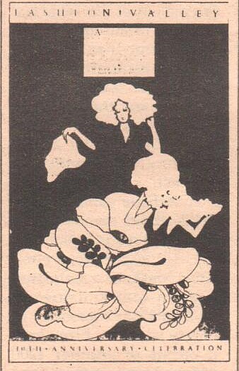
This fall, Fashion Valley's marketing director, Sonny Sturn, gave an artist free reign to design a series of full-page advertisements for the shopping center. The highly stylized and boldly colored illustrations were done by Hahn Marketing's Pat Ortega.
When driving north on Pacific Highway some night, slow down as you approach Hawthorn Street. The art deco building that used to be Miyake's Japanese restaurant now houses Fat City restaurant and bar. Above the entrance to the refurbished building shines a sight unusual in San Diego — a tastefully done neon sign. Credit goes to the Lumi-Nite sign company.
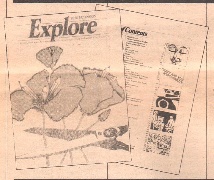
UCSD's Extension catalogue, Explore, lost its Whole Earth look this year. Higher quality paper, new phototype copy, and a new format gave it the look of a slick magazine. It took designer Frankie Pekin a full year to gain approval for the extensive changes.
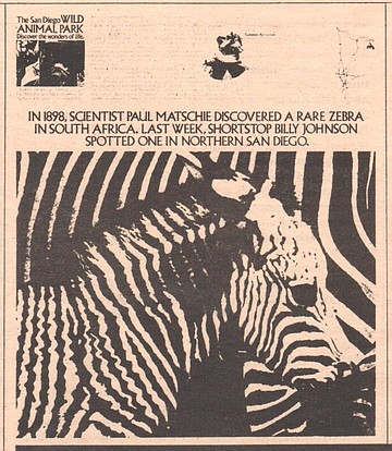
You've probably noticed on a bus, billboard, or in the newspaper one of those eye-stopping ads for the San Diego Wild Animal Park. Rob Colla, an art director at Phillips Ramsey, took an unusual route to give these ads their special look. For one thing, he drew heavily on material he gathered from the San Diego Zoo's photo library. When cropped and enlarged, the pictures took on new life. For another, the type style for the copy, Sara text, was ordered from New York through an exclusive arrangement with Thompson Type, and has never before been used locally.
In October, Payne Johnson's San Diego Home/Garden made its debut. While the quality of writing and the subject matter may elicit a few yawns, the snappy layouts alone are nearly worth the newsstand price. Take particular note of the typography: varied styles that are unusually sized and spaced. The magazine's art director, Tom Gould, formerly held the same position at Psychology Today. Perhaps an older and richer competitor, Sail Diego magazine, will now try to improve its pedestrian looks.
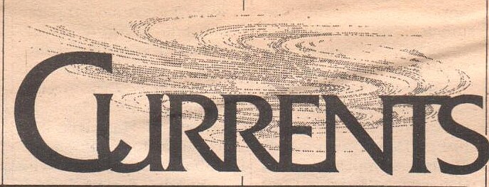
Reporters at the San Diego Union are fond of boasting about the improved quality of writing in their paper. But there have bee improvements this year as well — the paper underwent a minor facelift last July. The new "Currents" heads and separate logos for individual writers were created by Don Young of the Design Quarter. Young, though, must cringe now and then when he sees some of the graphic snafus elsewhere in the paper. So why doesn't Mrs. Copley let him redesign the entire paper? The Union at least deserves to look as nice as the New York Times.
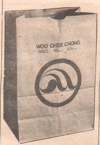
Calvin Woo, of HumanGraphics, saw the need for some "graphic uplift" when he was shopping at Woo Chee Chong, the pan-Oriental supermarket downtown. Using the shape of the yin-yang as a starting point, he produced a national awardwinning logo now reproduced on the store's stationery and shopping bags. He also wrote and designed one of those advertisements one can't help but read through in its entirety,

There may be a multitude of graphic designers living in San Diego, but the most interesting work is done by a relatively small group of exceptionally talented artists, and much of what they create is shipped out of town, never to be seen locally. However, there have been a number of outstanding projects this year produced for San Diego concerns, and listed below are a few of the better ones. (A more expanded selection of the best advertising, editorial art, and design for 1979 will be exhibited at the Communicating Arts Group banquet on January 25th.)

This fall, Fashion Valley's marketing director, Sonny Sturn, gave an artist free reign to design a series of full-page advertisements for the shopping center. The highly stylized and boldly colored illustrations were done by Hahn Marketing's Pat Ortega.
When driving north on Pacific Highway some night, slow down as you approach Hawthorn Street. The art deco building that used to be Miyake's Japanese restaurant now houses Fat City restaurant and bar. Above the entrance to the refurbished building shines a sight unusual in San Diego — a tastefully done neon sign. Credit goes to the Lumi-Nite sign company.

UCSD's Extension catalogue, Explore, lost its Whole Earth look this year. Higher quality paper, new phototype copy, and a new format gave it the look of a slick magazine. It took designer Frankie Pekin a full year to gain approval for the extensive changes.

You've probably noticed on a bus, billboard, or in the newspaper one of those eye-stopping ads for the San Diego Wild Animal Park. Rob Colla, an art director at Phillips Ramsey, took an unusual route to give these ads their special look. For one thing, he drew heavily on material he gathered from the San Diego Zoo's photo library. When cropped and enlarged, the pictures took on new life. For another, the type style for the copy, Sara text, was ordered from New York through an exclusive arrangement with Thompson Type, and has never before been used locally.
In October, Payne Johnson's San Diego Home/Garden made its debut. While the quality of writing and the subject matter may elicit a few yawns, the snappy layouts alone are nearly worth the newsstand price. Take particular note of the typography: varied styles that are unusually sized and spaced. The magazine's art director, Tom Gould, formerly held the same position at Psychology Today. Perhaps an older and richer competitor, Sail Diego magazine, will now try to improve its pedestrian looks.

Reporters at the San Diego Union are fond of boasting about the improved quality of writing in their paper. But there have bee improvements this year as well — the paper underwent a minor facelift last July. The new "Currents" heads and separate logos for individual writers were created by Don Young of the Design Quarter. Young, though, must cringe now and then when he sees some of the graphic snafus elsewhere in the paper. So why doesn't Mrs. Copley let him redesign the entire paper? The Union at least deserves to look as nice as the New York Times.

Calvin Woo, of HumanGraphics, saw the need for some "graphic uplift" when he was shopping at Woo Chee Chong, the pan-Oriental supermarket downtown. Using the shape of the yin-yang as a starting point, he produced a national awardwinning logo now reproduced on the store's stationery and shopping bags. He also wrote and designed one of those advertisements one can't help but read through in its entirety,
Comments